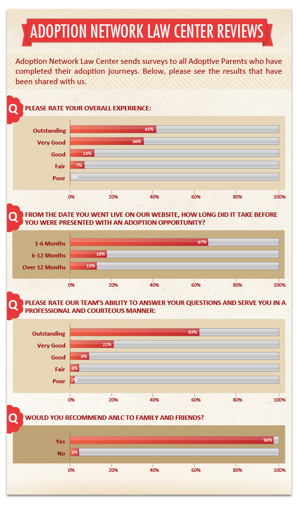
ANLC needed a visually appealing and easy to understand graphic that displayed the stat results from mailed out surveys. A complicated Excel sheet full of data was the point of reference for the project. The infographic was to be displayed on the company website in its own webpage for visitors.